|
Common Sense Technical Analysis An Interview With Brian Hunt
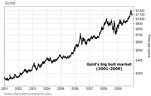
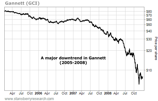
Options, Trading, and Short-Term Investing As Editor in Chief of Stansberry & Associates and a successful private trader, Brian Hunt has reviewed just about every type of technical analysis out there. He's distilled this complex subject into a few important ideas that can be a valuable addition to any trader or investor's toolkit. Whether you're looking to become a more successful short-term trader or just improve your long-term investing returns, we guarantee you'll find some great ideas below. Stansberry & Associates: It's often said that out of all the ways to analyze the stock market, none generates more confusion and criticism than the practice of "technical analysis"... also known as "chart reading." Before we get into the fine details, let's define our terms. Brian Hunt: As you said, technical analysis is often called "chart reading." It's the study of past market prices and trading volume in order to get an edge in the market. Some folks swear technical analysis is the "Holy Grail" when it comes to profiting in stocks and commodities. They'll tell you they've found chart patterns that regularly predict huge market moves. Some folks swear technical analysis is no different than using tea leaves and tarot cards to dictate investment decisions. They think it's all a bunch of B.S. There's a good reason to be skeptical of most technical analysis claims. Millions of books on technical analysis and millions of dollars of technical analysis advisories have been sold over the years... all marketed on the claim that certain gurus can predict the next big move in stocks or commodities. Just send 'em a check for $99 and you'll learn the secret. Many of these "secret formulas" are no better than flipping a coin to determine your trading direction. But over the years, I've found there are some useful "common sense" applications of technical analysis. They can help transform ordinary traders and investors into extraordinary traders and investors. These "common sense" applications don't try to predict the future. They simply help the trader gauge where an asset is relative to the big trend... and they help the trader see how an asset's fundamentals are affecting its price. S&A: That's the theory. Now let's cover some of these tools. Hunt: Let's start with the most important concept in technical analysis: what a trend is. Put simply, a trend is a series of price movements in one general direction. That's it. Since pictures speak louder than words, we'll use a lot of charts in this interview. We'll start with a chart that displays an uptrend. The chart below is the trend in gold prices from 2001 through 2009. You can call the price action here a "series of higher highs and higher lows." Each rally in gold takes it higher than the previous high... And each decline in gold ends a bit higher than the previous decline. That's all an uptrend is. Let's also cover what a downtrend is. Below is the downtrend in the share price of newspaper giant Gannett, which publishes USA Today. This chart shows Gannett was in a downtrend from 2005 through 2008.
You can call this downtrend a "series of lower highs and lower lows." Each rally in Gannett's share price ends a little bit lower than the previous rally... and each decline takes Gannett a little bit lower than the previous low. That's the key concept in technical analysis... the trend.
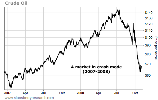
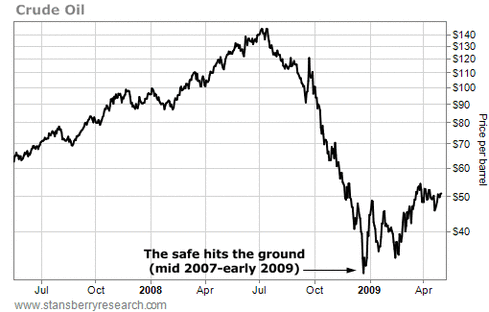
S&A: OK, let's move on to another concept I've heard you talk about – "respecting trends." How do you do that? Hunt: If you don't respect trends, you'll get killed in the markets. One of my favorite market analysts and investors of all time is Martin Zweig. Zweig's Winning on Wall Street book is considered one of the greatest books ever written on the markets. He achieved fame and fortune in the 1970s and '80s with his Zweig Forecast market advisory. He's also a successful money manager. Located in the middle of Winning on Wall Street is this timeless quote: "I can't emphasize enough the importance of staying with the trend in the market, being in gear with the tape, and not fighting the major movements. Fighting the tape is an invitation to disaster." In the early days of Wall Street, traders received updates by a machine that printed out prices on a roll of ticker tape. Even today, with the ticker tape machines long gone, traders still call market action "the tape." When Zweig says, "Don't fight the tape," he's really saying, "Don't fight the big trend." Hundreds of thousands of traders have blown up their trading accounts by trading against uptrends and by trading against downtrends. Most of these traders were sure they knew something the market didn't... Maybe an uptrend was due to end in a big crash... Or a downtrend was due to end in a big rally. So, they bet on them ending. Again, this is called "fighting the tape." And as Martin notes, it's an invitation for disaster... for the simple reason that trends tend to last longer than anyone expects them to. Or as legendary investor Jim Rogers reminds us: "Markets often rise higher than you think is possible, and fall lower than you can possibly imagine." This is why you never want to bet against a major uptrend or a major downtrend. Trends can last a long time... and you must either trade with the trend, or step aside. But never stubbornly trade against it. From a general standpoint, you want to be long uptrends, and short downtrends. And unless you are trading for lightning-fast moves of just a few days, never short a major uptrend, and never buy a major downtrend. Or in Martin Zweig's words, "Never fight the tape." S&A: But you can make big money when a trend goes from up to down, and vice versa. How should a trader do it? For example, what if you find an asset that is a terrific value and has a great bullish long-term argument for buying it, but is still locked in a downtrend? You want to buy, but you don't want to "fight the tape." Hunt: This gets to another key concept... the art of finding tops and bottoms. Let's start by looking at an important chart. This chart displays a type of price move that has bankrupted hundreds of thousands of people. So please pay careful attention to it. This is a chart of crude oil from early 2007 through late 2008. See that huge, sharp decline on the right-hand side? That's a market in crash mode. Some traders call this kind of move a "falling knife" or a "falling safe."
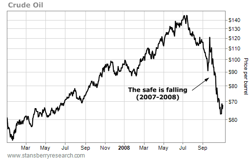
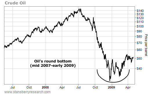
A market in such a sharp decline is nearly impossible to trade successfully. But that doesn't stop all kinds of people from trying to do so. Many people see this kind of fall and think, "It's getting cheap. It's due for a big rebound... and I'm buying." Many traders get a thrill from trying to pick the exact bottom or top of a runaway market. They perform the necessary fundamental analysis to realize a market is cheap after a big fall... or expensive after a big rise. Armed with this valuation knowledge, they go for the glory and start buying... and lose a bundle. Here's why: A huge move like the 2008 oil crash generates a lot of emotion in the marketplace. It catches most people off-guard. It causes big swings in their account values... both up and down. All that emotion produces wild markets with little concern for fundamentals. Whether an asset is overvalued or undervalued simply doesn't matter during these moves. So saying things like, "This stock is just so cheap" is only going to get you and your money in trouble. It's going to get you into risky trades. Instead of letting that sort of thing run through your head, remember that quote from Jim Rogers: "Markets often rise higher than you think is possible, and fall lower than you can possibly imagine." Markets are just big groups of people. People are irrational... even more so when their money is on the line and account values are jumping around like crazy. This makes trading against runaway trends – fighting the tape – a high-risk activity... There's a much lower-risk way to trade these moves. It's a lot easier on your blood pressure... and more profitable. Let's again consider advice from Marty Zweig. Zweig says trying to buy an asset in freefall is like trying to catch a falling safe. You'll always get squashed. His alternative is amazingly simple and profitable. Don't try to catch a falling safe. Wait for it to hit the ground... Then just walk over and pick up the money. Let's look at crude oil again. Instead of trying to catch the falling safe by going long crude oil in October 2008 when the chart looked like this... the smart speculator waits for the safe to hit the ground. He waits for the chart to look like this...
|
|
See that price action in late 2008? Traders who bought oil at $70 in October got a 50% "discount" from July's high of $140. They also lost half their money as the safe kept falling and falling. It eventually hit the ground at $35 in December. Few market players imagined this stupendous decline could happen to crude oil. But remember Jim Rogers: "Markets often rise higher than you think is possible, and fall lower than you can possibly imagine."
The safest time to go long crude oil and oil stocks came in February 2009. It was during this time that oil "carved out" a bottom. After hitting a low of $35 a barrel in December, oil rebounded into the upper $40 range. The oil bears countered this rally and tried to drive prices back down to the low several times. Each time, oil refused to reverse. As traders would say, oil "tested" its bottom. At this point, it's much safer to buy oil than it was in October 2008. Anyone who went long back then was buying into a sharp decline. Traders who waited on a bottoming out process – and waited for the safe to hit the ground – made a bundle as oil went onto rally into the $70s and $80s in 2009. They waited for the trend to get exhausted for all that emotion to get wrung out of the market. This "wringing out" process takes time... And it produces a "round bottom" like you see here: |
This strategy of avoiding sharp declines while trading round bottoms works for all stocks and commodities. It allows you to
stand safely aside as the safe hits the ground and spills out its contents. This line of thinking also works at market tops... and
allows you to make money when assets fall. Have a look at this chart. It's one of the great moves of the 2003-2007 stock rally.
stand safely aside as the safe hits the ground and spills out its contents. This line of thinking also works at market tops... and
allows you to make money when assets fall. Have a look at this chart. It's one of the great moves of the 2003-2007 stock rally.
|
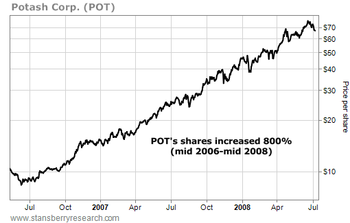
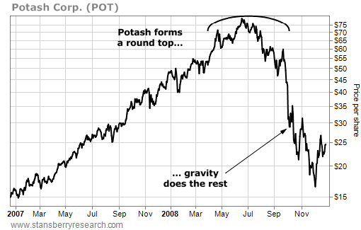
This chart shows the gigantic move Potash enjoyed from 2006-2008. Potash is the world's largest fertilizer company. In 2006, grain and farm prices went through the roof... So fertilizer producers went through the roof as well. Potash shares increased 800% in less than two years.
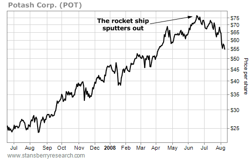
After fertilizer shares ran up hundreds of percent, the investment public caught on. The news was everywhere: Fertilizer prices are skyrocketing! Wall Street and Main Street went wild. People were so bullish on fertilizer shares, they were willing to pay between 40 and 60 times earnings for these stocks. That's a crazy price to pay for any company... let alone for one that produces boring crop fertilizer. So... you had two big "red flags" here. You had 1) a wildly overpriced stock, and 2) rampant bullishness from the investing public surrounding shares. Time to go short? No way. Look how sharp that rise is again. Sure, Potash is super-expensive and "should" suffer a big correction soon... but remember Jim Rogers: "Markets often rise higher than you think is possible, and fall lower than you can possibly imagine." Potash shares were still rising. The stock was a rocket ship with plenty of momentum. It was too risky to trade. At that point, the right thing to do was place the stock on your watch list and wait for the flame at the bottom of the rocket ship to sputter out and turn cold. Here's what that "flameout" looked like: |
As you can see, Potash peaked around $77 in June 2008. It entered a perfectly natural correction at the end of the month.
Then the bulls tried to push it skyward again. That rally couldn't push it above $74. It failed the "test." The flame was sputtering.
Potash's chart had changed from a sharp uptrend to a round top. It was time to bet on the short side and let gravity do the rest.
Here's what happened over the next four months:
Gravity really worked Potash over. The stock fell 75% from its high. Short sellers made a fortune.
S&A: Let's move onto another concept: breakouts.
Hunt: In addition to knowing how to identify a trend, it's crucial the trader learns how to identify a breakout. A breakout occurs when
the price of an asset reaches either a new high point or a new low point for a given time period. An "upside breakout" is when the asset
hits a new high. A "downside breakout" is when an asset hits a new low.
Breakouts can be either short-term (about five or 10 days) intermediate-term (like more than 30 days) or long-term (more than 200 days).
Breakouts serve as a starter's pistol to signal the beginning of a trend. No uptrend can start without an upside breakout... And no
downtrend can start without a downside breakout.
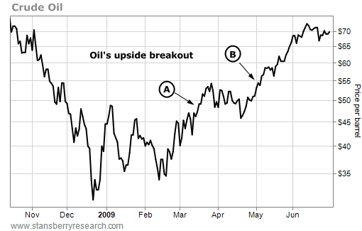
Let's look at a few examples. After suffering the big decline of the late 2008 credit crisis, crude oil traded sideways for months before
staging an upside breakout around $48 per barrel in mid-March (A). It then proceeded to drift sideways in the high $40s before staging
another upside breakout around $55 per barrel in early May (B).
As you can see, the concept of an "upside breakout" is simple. It's when the price of an asset moves into a new area of higher prices.
In oil's case, that move in early March took crude to its highest closing price of the past 60 days. Traders call that a "60-day upside
breakout." Now let's look at a downside breakout. The chart below displays the downside breakout in shares of Potash during the
summer of 2008.
In oil's case, that move in early March took crude to its highest closing price of the past 60 days. Traders call that a "60-day upside
breakout." Now let's look at a downside breakout. The chart below displays the downside breakout in shares of Potash during the
summer of 2008.
|
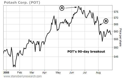
After peaking at $77 in mid-June (A), Potash drifted lower into the $70-per-share range. It then staged a downside breakout in August (B)... taking shares all the way down to $51. This was the lowest closing price in 90 days for Potash... So you can understand why we call this a "90-day breakout." Keep in mind... it's also a 60-day breakout, because if shares are hitting their lowest level in 90 days, they are also at a 60-day low... as well as a 30-day low and a three-day low.
Breakouts are important because they signal possible trend changes. If you are looking to trade an asset in one direction, it helps to wait on a breakout before making your move... It helps to wait for the market to "confirm" your belief. Waiting for a bit of price confirmation ensures you aren't fighting the tape... or placing your money into assets that are drifting sideways for long periods of time. For instance, let's say you turned bullish on crude oil in February 2009. Waiting on that upside breakout in March ensures the market is moving in your direction. It ensures you are trading with the trend... no matter how short- or long-term your horizon. The same goes for a trader looking to bet against Potash. Let's say you wanted to short Potash in June. You'd want to wait for a breakdown to signal a trend change before making your trade. You'd want to see some share price weakness to confirm your thesis. Even if it's just a bit of share price weakness – say in the form of a short-term five-day downside breakout – that's considered waiting for market confirmation. Following breakouts is no Holy Grail of trading. Breakouts can reverse in a hurry. When an asset stages a breakout in one direction, then turns right around and heads in the opposite direction soon after, it's called a whipsaw. Whipsaws are just a fact of trading life. Below is an example of a whipsaw... |
|
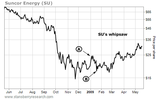
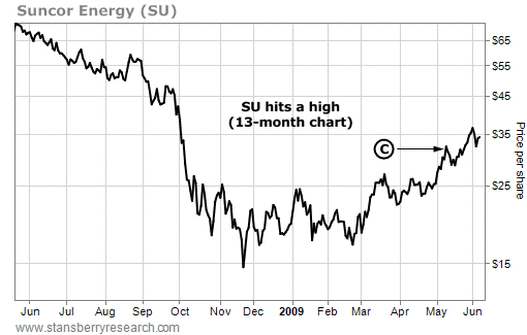
The chart above displays the share price action of oil company Suncor from mid-2008 to mid-2009. A trader bullish on Suncor might have bought shares when the stock staged a 60-day upside breakout near $22 in late December (A). That trader would have had to endure a sharp whipsaw down to $17.50 per share in the following weeks (B). Depending on where a trader has his stop loss, this whipsaw could kick him out of the trade.
Below is the same chart of Suncor, with a few more months' shown. You'll note that Suncor eventually broke out of that $22 area and ran into the high $30s (C)... but there were a few months of sideways "whipsaw action" that a trader had to deal with. This is simply how the market works... one must deal with these situations by sticking to your protective stop loss orders... and knowing from time to time you'll have to deal with whipsaws that nearly trigger your stop losses, kick you out of trades, or produce a few months of frustration. |
|
To sum things up, waiting on price breakouts – either short-term or long-term – before trading increases your odds of success because you are getting in line with the market. You're going with the tape, rather than against the tape. That's all you really need to know about this simple but critical technical concept.
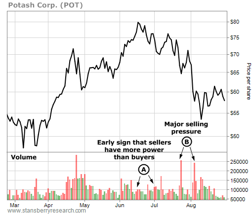
S&A: What are some other common sense tools one can use to spot market tops and bottoms? Hunt: We'd better cover "acting well" and "acting poorly." These are two more things that aren't trying to predict anything... they aren't "reading tea leaves"... they're just common sense tools that help us time trend changes. Let's go back to our Potash example from mid-2008. Remember... back then, Potash was in the middle of a huge bull market. Shares were up 800% in two years. Tons of CNBC guests talked about how bullish they were on fertilizer stocks. You'd hear stuff like, "Things couldn't be better for the industry." Retail investors across the country started hearing about high crop prices and rising fertilizer shares on the nightly news... And they started reading about them in the local paper. Food riots broke out in Mexico and Indonesia. Fertilizer companies were reporting incredible increases in revenue and profits. The Market Vectors fund family even launched a new agribusiness ETF to capitalize on investor interest toward the sector. Then... on July 24, 2008... Potash came out with a stunning earnings report. Earnings came in at $905.1 million... a 220% increase from the year before, and the highest total in company history. "This quarter established a new standard of performance for our company," CEO Bill Doyle said. Shares fell 3.3% on massive trading volume as a result. Yes... I said "fell," not climbed. Potash reported the greatest quarter in company history... a "new standard" in profitability... and was clobbered for it. This horrible performance in the face of great news is what happens when a trend is changing. It's called "acting poorly"... and it's another vital technical concept to know. As you can imagine, when an asset cannot rally in the face of wonderful news, it's a huge bearish sign for that market. It's a sign that all the great news and all the great fundamentals going for the market have been "priced in" to that market. It's a sign there aren't enough buyers in the market to help drive prices higher. They've been exhausted. Just as it's bearish for a bull market to fall on great news, it's bullish for a bear market to rally on horrible news. Consider the case of Intel... In April 2009, things were horrible for Intel. This was around the time of the 2008-2009 credit crisis. Many folks were worried the "The Great Depression Part II" was around the corner. Intel shares fell more than 50% in four months. Intel is the world's largest maker of semiconductors... the tiny "engines" that power the world's computers. If another Great Depression was in the cards, people wouldn't be buying computers... and Intel's business would suffer. In mid-April, Intel reported a huge quarterly sales decline of 26% from the previous year's quarter. Profits fell 55%. Intel also offered a "blurry" outlook for the rest of the year. Wall Street hates "blurry." So what happened to Intel shares after this news? They held like a rock! When a bear market has a bullish reaction to horrible news, that market (or stock) is said to be "acting well." It's a sign the sellers of that asset are exhausted and out of ammo. It's a sign the downtrend is likely finished. In Intel's case, the downtrend was finished. The stock rallied 50% over the next 12 months and was one of the top-performing stocks of the year. This rally kicked off when Intel started "acting well." To summarize, when a bull market sells off in the face of great news, it's a bearish sign. When a bear market rallies in the face of horrible news, it's a bullish sign. S&A: OK... one more concept. Let's cover trading volume. Hunt: That's a good one to end on. One more time, let's look at the enormous 2008 drop in shares of Potash. This situation can teach us another powerful technical concept... The concept of trading volume. Each day, the exchanges track the amount of trading volume in each stock index and each single security. This volume measures the amount of buying and selling activity present during the day... The higher the volume, the greater the amount of buying and selling activity. Volume can serve as a useful tool because it allows you to track "elephants." The stock market is dominated by large money managers... folks who run pension funds, insurance funds, mutual funds, and hedge funds. Many of these managers control billions of dollars in client assets... And when they decide to enter or exit a position, they can't do it over just a few days. They have to spread their buying over months. They even have to hire people whose main job is to determine the best way to plow big money into individual stocks. These big money managers are the elephants in the stock market. They create the huge moves that become market trends. Remember, their portfolios can run well into the billions of dollars... So even a rich individual with a $5 million trading account is a mouse compared to these elephants. You can track elephant behavior with trading volume. I'm not going to say trading volume is the magic key to stock market profits. I do believe, however that there are two tried and true guidelines for using trading volume to increase your profitability. One is a stock experiencing heavy trading volume on down days and light trading volume on up days is being sold by the big money. The elephant tracks are pointing in the direction of lower prices. The phenomenon of "lots of trading volume on down days, not much trading volume on up days" is sometimes called "distribution," and it's especially useful when trying to determine the end of an uptrend. Let's take a look at Potash again. We're sticking with the same time period of mid-2008... when the big uptrend ended, and eventually turned into a big downtrend. You'll see some green and red bars at the bottom of the chart below. These bars represent Potash's trading volume. Green bars represent days the stock advanced in price. Red bars represent days the stock declined in price. The taller the bar, the greater the volume. |
|
Note that in June and July, the red bars (days Potash declined) started to get just a bit bigger than the green bars (days Potash advanced) (A). This is an early sign that sellers have more power and more conviction than buyers. Now note the tall "skyscraper" red bars in late July and early August (B). This is major selling pressure.
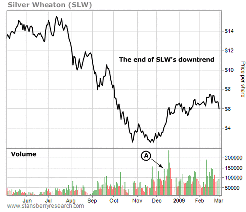
Even worse, this selling pressure came on the great earnings report I just mentioned. Several elephants were fleeing Potash shares. And as you'll recall, Potash shares lost over 66% of their value soon after. When you see a stock or stock index that was up big over the past few years start to exhibit this sort of "heavy down volume, light up volume" pattern of trading, it's a major warning sign the trend may be ending. A healthy uptrend enjoys big trading volume on buying days, not big trading volume on down days. For our next guideline, we just flip things around and say a stock experiencing heavy trading volume on up days and light trading volume on down days is being purchased by the big money. The elephant tracks are pointing in the direction of higher prices. The phenomenon of "lots of volume on up days, not much volume on down days" is sometimes called "accumulation," and it's especially useful when trying to determine the end of a downtrend. Perhaps the stock has fallen so much it has become an irresistible value... Or maybe the tough industry conditions hurting the business are over and large investors are taking notice. For example, let's look at shares of Silver Wheaton from mid-2008 to early 2009. Silver Wheaton is a company that finances early stage mining projects. It receives a slice of a project's revenue if it turns out to be a successful silver mine. Thus, the company tends to move up and down with the price of silver. In late 2008, the price of silver crashed in response to the big 2008 credit crisis. The metal fell from $19 per ounce to $9 per ounce in less than five months. Silver Wheaton fared even worse... falling from $14 per share all the way down to $2.56. That's when the elephants started picking up shares... Below is a chart of Silver Wheaton from mid-2008 to early 2009. Note the surge of buying volume in December, as represented by the series of tall green bars (A). These are elephant tracks, and they signaled the end of Silver Wheaton's downtrend. The stock went on to gain more than 400% over the next 15 months. |
Entire books have been written about volume analysis, and many traders use sophisticated formulas to track volume trends. But for
the great majority of traders, these two guidelines are all you need to know about trading volume. You need to know that it often
signals the end of big trends... it signals market extremes. Most of the time, this volume analysis isn't going to tell you much.
Here are the guidelines one more time: One... when an uptrend enters a period of huge selling volume, it's a sign the trend is near an end...
a sign the big money is cashing in and bailing out. And two... when a downtrend enters a period of huge buying volume, it's a sign the trend
is near an end... a sign the big money is seeing value and buying up shares.
S&A: That's a great set of common sense tools. Anything you'd like to leave the reader with?
Hunt: Once again... common sense technical analysis is no magic bullet. It's simply a way to help time your trades to ensure the biggest
profits. Some traders have made incredible careers out of trading on advanced forms of technical analysis alone. But for most folks, it's
best to "marry" basic technical concepts with fundamental measures of value. The two schools of thought can produce incredible
investment results.

